Creative rebranding for advertising
PENNTHE BRIEF
PENN approached us requesting assistance in reviewing their advertising style and approach. They decided to create a brand-new look that fully expressed the new PENN values and quality.
THE SOLUTION
The approach we took was relatively simple and became apparent after reviewing their historical and current advertising. The solution required a completely new concept with a clean and clear consistent message.
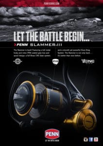
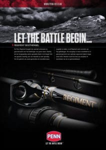
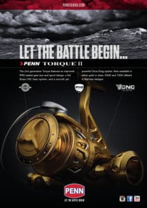
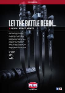
The brand required a strong and quiet confidence. PENN was well known for its quality. Our photography sought to express this, by balancing the two key ingredients, a beautifully-lit product and its respective stylised aquatic environment. A carp rod and reel would be placed next to a tranquil mirror-like lake, juxtaposed with a roaring wild sea as a backdrop to deep-sea fishing. The style and colour were controlled to present a consistent dynamic, engaging advert which increased the perceptions of quality and strength. The solution conveyed a sense of adventure, that is synonymous with the brand, ‘PENN’.
Services used:
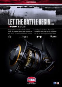
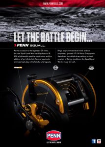
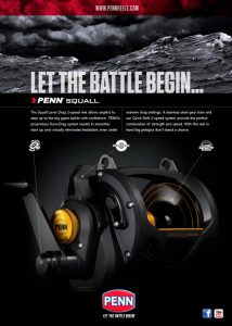
VISUAL TENSION OF NATURE
The new advert design is simple in structure. Utilising two key elements. The first is the drama of a sea or lake image, always styled and colour graded to this blue grey tone. The second a luxurious, beautifully-lit product shot. To convey an increased perceived value. The combined effect creating a powerful visual tension.


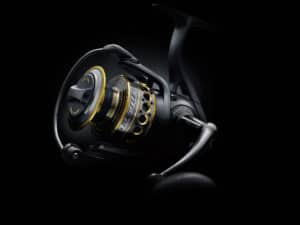
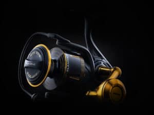
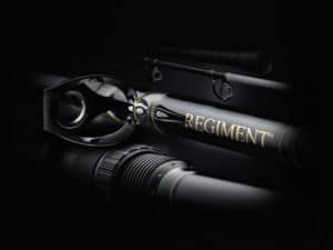
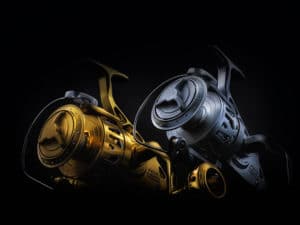
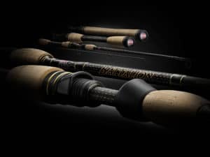
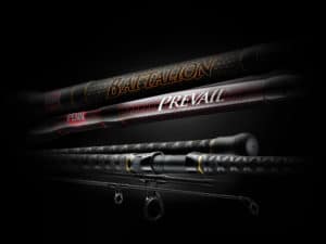
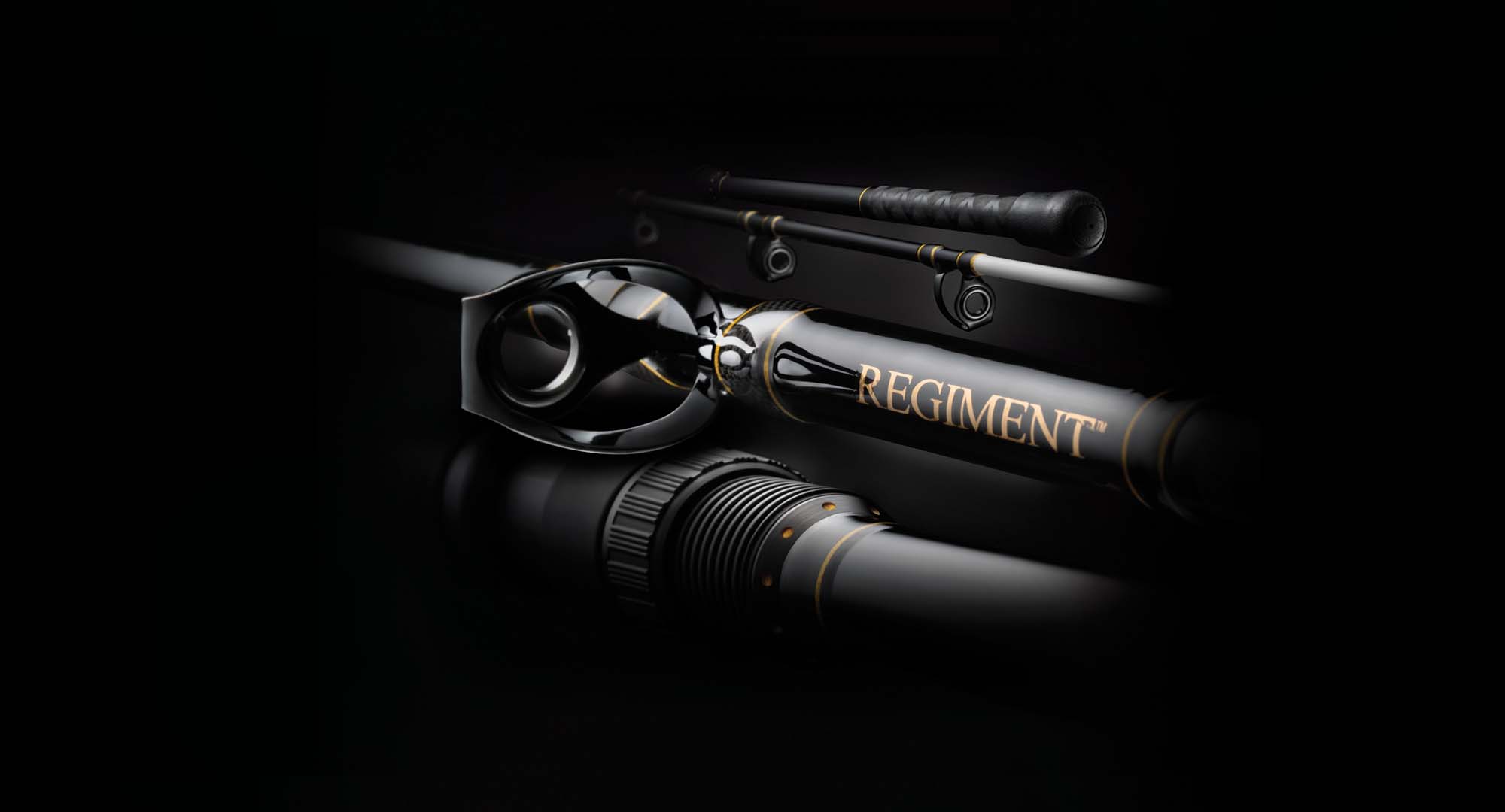
PRODUCT SHOTS & LIGHTING
By controlling the light we have created a real sense of mood and drama, increasing the engagment of the products. Leaving some detail in the shade adds to the intrigue and confidence of the image and brand message.


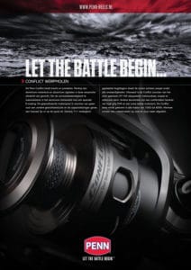
Example Adverts

Product shots